The internet world has forced us to use various online tools in our daily work life; many companies are now operating using google spreadsheet, google docs, which are online tools yet more effective than any other free ones. The use of Google spreadsheets has increased tremendously in the last few months because people love to use them to collect various information and make necessary changes. However, when it comes to using bar graphs, people are still naive or at least don’t know how to make bar graphs in google sheets.
So if you are an employee or have lots of data that needs to be shown visually stunning, then there is only one way you can do that, and that’s by using a bar graph in a google spreadsheet. People often know the fact spreadsheet is best for using and merging various types of data, but when it comes to presenting, they need to make the right use of the bar graph. In this article, we have explained how to make a bar graph in google sheets in the easiest manner.
How To Make Bar Graph In Google Sheets
You will create a bar graph in a google spreadsheet by following these simple steps, which are quite easy to follow and implement easily.
- First, open the sheets.google.com.
- Highlight the cells which contain the data you want to visualize.
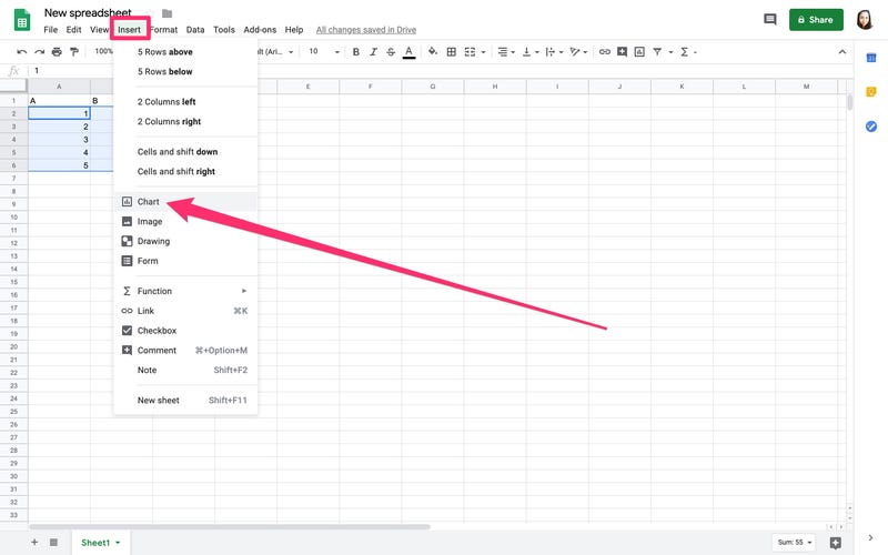
- Then from the toolbar section, click on “Insert” and then “chart.”

- Now under the Chart section click on “dropdown.”
- Scroll down till you find the Bar section.
- Now select the graph bar accordingly.
So this is how you can select and create a new graph chart in your google spreadsheet. You can make lots of changes to the graph which you want to add, like aggregating various data or changing the range of data.
Add Chart And Axis Titles In Google Graph
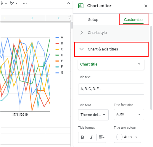
One of the problems with newly created graph charts is pulling the title from the date range you selected. However, if you want to add some customized version of Chart and Axis titles, you can also do that by following simple steps.
In the chart editor tool, click on the “customize” option, and then click on “chart and Axis titles” to display the submenu. You can customize the title according to your wishes in this..
How To Make An X Y Graph In Google Sheets
When you want to create an x y graph in google sheets, you have complex data that needs to be visually displayed correctly. Scatter plot is with the help of creating such a type chart because it involves the use of two-dimensional space. In simpler words, you can show variables on the X and Y axes. So here is how you can scatter plot in your google spreadsheet.
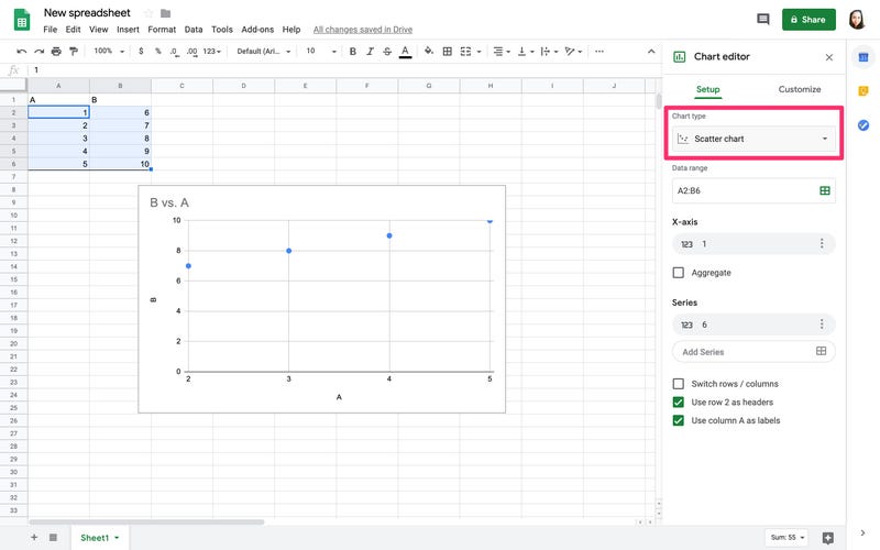
- Highlight the columns of data, including the header.
- Then click on “Insert” and then “Chart.”
![]()
- You will see a sample bar chart now.
- Go to Chart>data tab>scatter.
- Now you have a scatter chart.
This is one of the simple yet effective ways to create an x y graph in a google spreadsheet. Interpretation of scatter charts is also important because many people who use them might not get what they have just created.
The dots on the scatter chart will show you the upward or downward trend of your selected data. There are various use of this.
Conclusion:-
So these are the best ways to create the br graph in th google sheets. Usually, when you are using th google sheet for either your p[erosnal or office work, we don’t give much importance to the already available tools and utilities. In such a case, the best thing you can do is follow th online instructions on creating the graph bar or charts, which would help you for sure. We hope you got at least some insights on this topic, and if you are wondering about th related topic or got some doubts leave a comment down below, we will be happy to help you out.

Venkatesh Joshi is an enthusiastic writer with a keen interest in activation, business, and tech-related issues. With a passion for uncovering the latest trends and developments in these fields, he possesses a deep understanding of the intricacies surrounding them. Venkatesh’s writings demonstrate his ability to articulate complex concepts in a concise and engaging manner, making them accessible to a wide range of readers.